Product

Customise Progress Bars & Account Colours

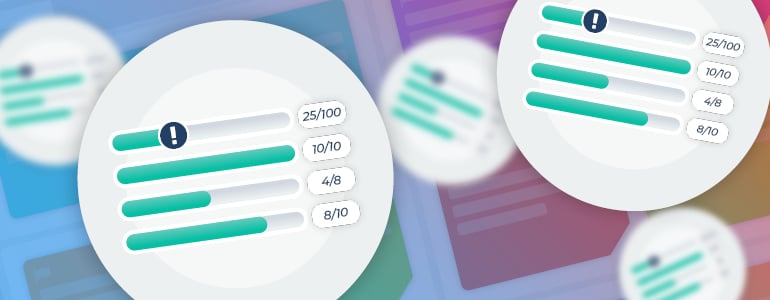
Progress bars featured image

You can now customise the colour of the progress bars in your account alongside your other account colour settings.

Method Grid lets you customise the look of your account with controls over the colours and logos used. In our latest release we have expanded these controls to include setting your progress bar fill colour and separating the colour controls for the navigation bar.

Setting custom colours

Members with architect (super admin) level access can customise the colours used throughout your account within the account settings area:
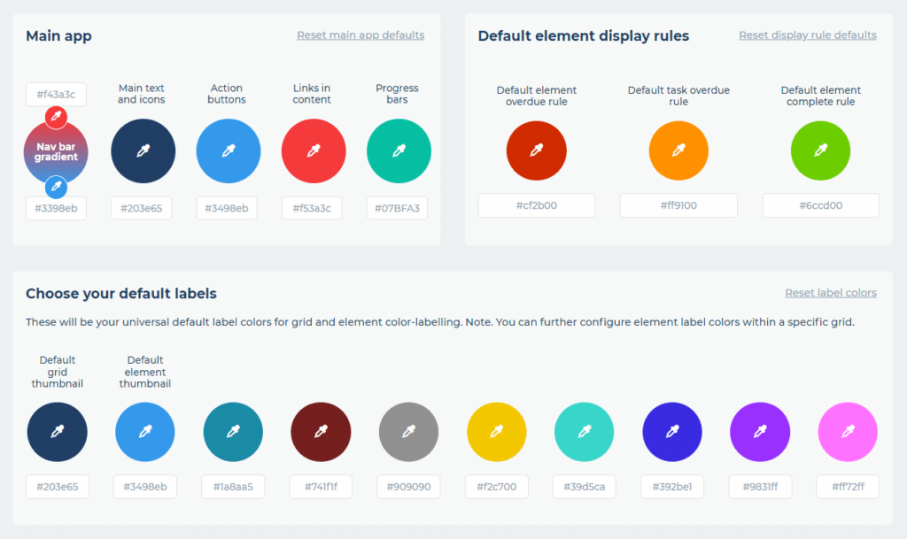
The custom colours settings area

You can set the colours to use in three main categories:

  1. Main app – These colours set the main brand colours throughout your account e.g. the navigation bar colours, button colours, font colour etc.
  2. Default element display rules – These are the default colours used when you view the display rules in your grid that show when an element is overdue, a task is overdue and when an element is complete. These colours can also be set at the grid level to override these defaults.
  3. Default label colours – These are the ten default label colours for the elements in your grids. These colours can also be set at the grid level to override these defaults.

Setting the custom colour for progress bars

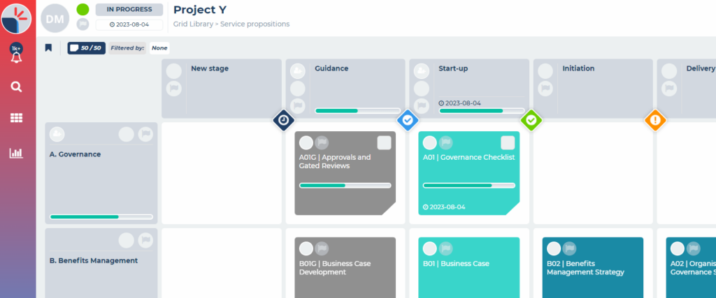
In the main app colour settings area you can now set the colour you want to use as the fill colour in the progress bars throughout your account, for example within your grids:

A project grid showing progress bars

This colour is applied as the fill colour in all progress bars throughout your account.

We have also improved the look of the progress bars throughout the app to make them clearer to read and understand.

Setting the custom colour for the navigation bar

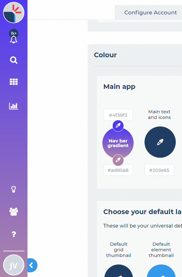
In the main app colour settings area you can now also set the colours you want to use as the gradient fill colour of the main navigation bar throughout your account:

The main navigation bar with custom colours applied

The colours used in this gradient for the main navigation bar were previously shared with other colour settings. They are now separated out to give you more control over your account’s branding. Any customisation already made in your account has been preserved.

Feedback

If you have any feedback on this release, please get in touch.

What’s Next?

We will be rolling out more UI changes and improvements across the application in the coming months. You can see all of our upcoming releases in our product roadmap.

Thought Leadership

The evolution of business playbooks – the shift from static content to dynamic digital playbooks 

For decades, organisations have heavily invested in codifying complex processes into static content such as PDFs, PowerPoint presentations, and SharePoint...

Product

New Embeds Content Area

You can now embed other platforms into your Method Grid elements and stages gates....

Renewables

Scaling to meet the Renewables energy challenge

This investment aims to accelerate the growth of green industries, support economic growth and enhance UK exports, while modernising infrastructure...


We would love to hear from you …

Product

UI Updates and Element Full Screen Option

Continuing the roll out of the UI improvements that started with adding view/tool shortcuts to your grids and elements within...

Resources

Lessons Learned 2.0 Resource Hub

Welcome to our dedicated resource hub for Lessons Learned 2.0. Here you will find the Lessons Learned 2.0 White Paper,...

Product

Grid Task Log Stage Filter

To quickly review and work with all the tasks in specific stages of your project grid, you can now filter...

GRIDtalk: Creating a Renewable Energy Project Delivery Playbook for SSE Renewables Register