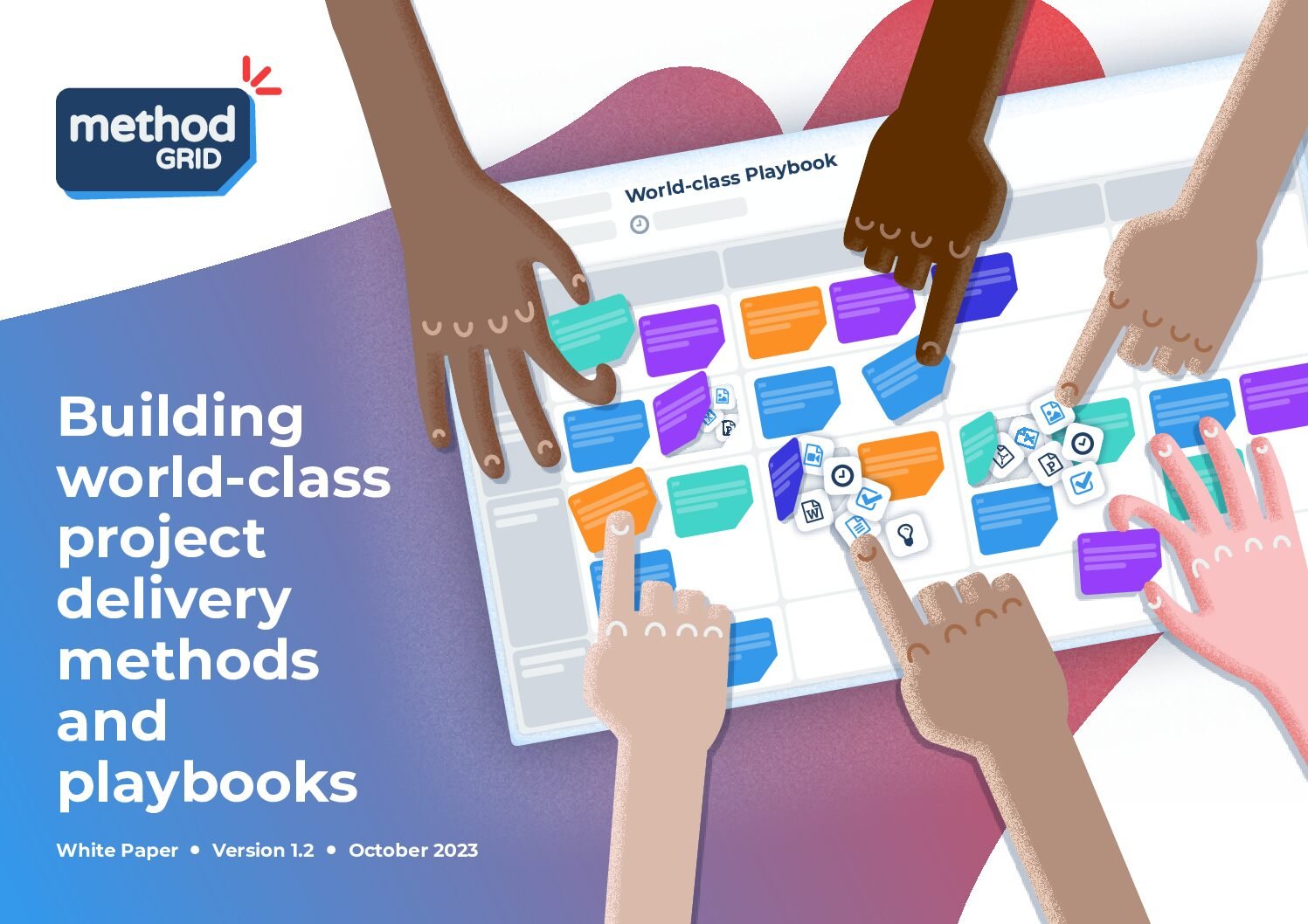
At the core of our business is the mission to help clients and the industry share best practices. With invaluable support from our clients, we are pleased to announce the release of our White Paper, ‘Building World-Class Project Delivery Methods and Playbooks.’ This paper is a testament to the innovative strategies and approaches we have […]
Join us for an insightful GRIDtalk where we dive into using Method Grid to manage residual risks for project assurance, hosted by Method Grid Principal Consultant Sam Bentley and Director of P3M Services at Step 5 Group, Edward Arrowsmith. Learn how Method Grid facilitates a comprehensive approach to assurance, moving beyond traditional perceptions to embed […]
It’s here! Announcing Phase 1 of the new look Method Grid (plus a glimpse of what’s to come!).
Tom Knights /
/
August 12, 2019
Out with the old, in with the new - A breath of fresh air - A contemporary approach - Code overhaul (it's not just about the aesthetics!) - Better UX
We are excited to announce the launch of what we are calling ‘Phase 1’ of the new look Method Grid. Following our recent, comprehensive user community survey and after a couple of months of intensive design and development, it’s finally here … and we are delighted to present it to you!
What has changed in Phase 1?
Well, where do we start? If you are already a user of Method Grid you will have hopefully already noticed the changes – as they are pretty significant.
Without boring you with endless details of the design process, let’s just simply say that the design is now much more contemporary. Gently rounded corners pepper the app – we are rid of all the hard corners and harsh lines. The grid is bigger and better. Not only does it look more modern, we have rebuilt how it works from the bottom up. Now grids scroll more fluidly in all directions with sticky themes and stages so you always know where you are. Reordering stages, themes and elements is much smoother and no longer needs a page refresh to distract you from your gridding.
We have also updated the typography to a font with a more sophisticated style and a bigger family of weights.
The redesign also gave us the perfect opportunity to make some fundamental updates to our framework. Method Grid is now completely up-to-date and able to make use of all the latest browser technology. It is more robust as a result and the coming features and ideas will be more advanced because of this new foundation.
So, what are the other future phases?
Phase 2 will quickly follow this release and will see the introduction of quick delete and labelling functions on all elements at the grid level.
Phase 3’s new feature will be the ability to have multi-column stages. With the simple click of a left or right arrow, you will be able to horizontally expand or reduce any stage width to allow for as many elements as required. This gives your more control over the presentation of the grid, eliminating deep grids that have element heavy stages. This is a bigger piece of work but will be hot on the heels of Phase 2.
One of the main reasons for undergoing a bit of a redesign (aside from the obvious one of making Method Grid much more pleasing to use and proudly show off), is to prepare for other features coming up on our dev roadmap.
Once Phase 3 is out the door, we will be working on: customisable branding colour palettes, bespoke labelling, the (PPM-related) assignment of resource/schedule-dates to tasks/elements/stages/grids and reporting dashboards to accompany such features. The design work is already well under way for these exciting new developments and we are, as always, seeking input from our user community to make sure we get all these aspects absolutely right.
We hope you will continue to join us on this journey and that you get as much joy out of using the new look Method Grid as we did in bringing it to life!
Please continue to keep the feedback coming (there is nothing we like more) – first impressions with new look etc.
Is there a feature you would love to see us add to our development stack? If so, please let us know in the comments below or email [email protected]
For decades, organisations have heavily invested in codifying complex processes into static content such as PDFs, PowerPoint presentations, and SharePoint...