Visual management as part of risk management and the risk management matrix
Before we get going, an introduction and an important credit. This blog discussing visual management in risk management was very much inspired and initiated in conversation with Ed Watson. Ed is a Transformation Director at Equiniti – a FTSE250 financial services company (professional account holder with Method Grid).

Method Grid at Equiniti
Ed’s primary use-case of Method Grid – initially at least – was as a solution to capture, structure and curate user guides and support for a major internal ERP implementation (Workday) that was being rolled-out across their c. 5,000 pax organisation.
It was some weeks into this use-case when, in conversation with corporate risk and compliance management colleagues, his mental lightbulb popped on another powerful application of the platform.
Ed kindly picked up the phone at this juncture and shared his insights with me; everything he said resonated hugely with my own personal experiences of risk management (from major transformation initiatives to corporate strategic risk oversight as an MD and board advisor).
And so this blog post was born.
Ed’s perspective was triggered by mild frustration at the inadequacies of their incumbent project management solution – as harnessed for risk management – “essentially as a glorified spreadsheet with a few more bells and whistles”.
The problem he went on to say: “isn’t that such risk management systems lack functionality – if anything they have too much – they’re simply too complicated.”
We both agreed – the absence of sound risk management practice is rarely a function of process and tool availability – more the function of an absence of excitement.
Ed: “if we are honest, reviewing a spreadsheet of risks – even one with bells and whistles – is just painfully dull.”
The logical retort might say: “well, risk management is boring but also very important – just get on with it” but the brutal reality is just that so many don’t get past the ‘boring’ aspect – despite full acceptance of the discipline’s imperative.
So, how do project/programme/team/corporate leaders bring risk management to life?
Further discussion ensued.
Risk management ingredients
Ed proposed that risk management has three essential ingredients.
Firstly, a managed risk needs to be unambiguously stated and clearly understood. There are a number of formulas for risk annotation but Ed’s preferred scheme is of the form:
- As a result of <certain condition>
- There is a risk that <uncertain event> may happen
- That will lead to <potential impact>
Secondly, each risk must have a single, nominated owner – equipped and empowered to do something about it.
Thirdly, there must be an unrelenting, primary focus on the forward-looking treatment of risks (and not endless pontification over whether the historical pre-mitigation score was 26 or 27 in version 134 of the corporate RAID Log).
What – we mused – binds such ingredients together?
The answer. Visual management.
Visual management in risk management
The core purpose of visual management is to improve the effectiveness of team communications. As powerfully reinforced by the schools of lean manufacturing, visual aids and teamboards can convey messages faster – and invite more interest and engagement – than the written (or spreadsheet) equivalent.
Visual management in risk management, done well, can communicate a complex set of information in a form that requires little or no training to interpret.
So, to bring risk management to life we don’t need more complicated spreadsheets. We don’t need more bells and whistles. We just need a way of visualising risks in a more meaningful and engaging way.
Ed’s musings totally meshed with my own experience.
Whether it is a major transformational programme or a company board meet, the brutal reality with strategic risk management is that there is a (very finite) amount of “cerebral capacity in the room” for these critical conversations (and decisions). Especially so with respect to risks that require collective analysis, reflection and treatment – as the strategic ones invariably do.
The challenge, therefore, is to ensure this finite capacity locks onto a manageable set of risks via a mechanism that is collectively easy to navigate. The enemy is the long, poorly-organised, visually-disengaging presentation that even the brightest minds drift away from. At one level, graphical presentation may feel like a somewhat facile aside to an inherently weighty topic – but, alas, that is the reality of the busy executive condition.
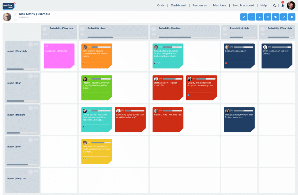
The most effective programme and company boards I have played a part in – have recognised this reality. A common feature of the most effective corporate boards I have attended is per the following illustration.
At the end of a quarterly board day, a final section on “Risks and Opportunities” facilitates a final “mop up” discussion on the strategic risks and opportunities that haven’t been covered during prior discussion (inevitably, many of them have – as is the nature of such a governance event). The optimal visual management of this exercise is a simple, classic risk matrix (X axis denoting probability; Y axis denoting scale of impact). One matrix (grid) for risks and another for key opportunities; importantly, no more than 15 risk or opportunity items respectively on each (arguably, ten might be a more manageable cap). Each of these items – with clearly assigned, single owners – is then reassessed working logically (and visually) from the high probability, high impact (typically top left) corner.


